Comic art critique: figure drawing, proportions, pose, shape
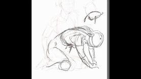
In today’s comic art critique we’ll be taking a look at some female character designs that were created by Philipp Nietsch for the Superheroines Course.
Click here for more information on Comic Book Character Creator: Superheroines: https://www.howtodrawcomics.net/superheroines
Like many other students, and aspiring comic book artists alike, the poses Philipp come up with in his figure drawing’s aren’t inherently bad. But there are small, minor changes he could make that would significantly impact the amount of personality, attitude and aliveness expressed through the body language of his characters.
When it comes to figure drawing, especially for comic book characters, the key is to keep your figures loose and gestural to capture as much movement in the pose as possible. Because as you begin to refine the character and build up their design the drawing will naturally begin to stiffen up.
The best way to avoid this is to keep your refined line work strong and energetic, encompassing the primary contours of the drawing with straight, purposeful lines that are drawn with speed.
Exaggerating the shape of the characters anatomy can also help to give them more visual interest and a greater amount of impact on the page.
Proportions also play a key role when it comes to designing powerful looking Superheroines. Although in reality people come in all different shapes and sizes, Superheroes specifically are often drawn with idealized heroic proportions. This means that on average, their overall height measures out to be about eight heads tall.
Within that height ratio, the different parts of the body also need to be sized up accurately in relation to one another. Most of us, especially when we’re starting out fail to do this, and end up with a character that doesn’t quite look right, and much less heroic.
The proportions of a character are really established at the foundations stage of the drawing, where the figure is being placed and posed into position using a very simple mannequin like structure. In addition, by using the primitive forms of the mannequin model figure, we’re also able to construct the character with form in mind. As a result, we wind out with a Superheroine that has an added level of three dimensionality built into her by design.
Another area of concern that comes up for most students undertaking the assignments in the Superheroines Course is balance. Without considering the proper weight distribution within the poses of your figures they’ll appear as though they’re about to topple over. Their body weight won’t have the correct amount of support where it’s most needed. For a figure’s pose to appear as though it has mass and weight, balance is one of the key components that must be implemented correctly.
In this video, I’ll be reviewing all of Philipp’s female poses, highlighting many of the flaws that I’ve mentioned above, and the fact that almost all of us struggle with them. Almost every student who has enrolled in the Superheroine’s course has run into these same problems, and there’s a good chance you might have too with your own figures. So I hope you find this critique session just a valuable as Philipp will.
Thanks for watching. And again, if you’re like to know more about the Superheroines Course, just click here: https://www.howtodrawcomics.net/superheroines
-Clayton
Software Used: Manga Studio
If you like the video, show your support by commenting, sharing or subscribing.
Comic Art Community – https://www.howtodrawcomics.net/comic-art-community/
How to Draw Comics .NET – http://www.howtodrawcomics.net/
Instagram – https://www.instagram.com/howtodrawcomics/
Facebook – https://www.facebook.com/howtodrawcomics
Twitter – https://twitter.com/howtodrawcomics
Tumblr – http://howtodrawcomics.tumblr.com/
Pinterest – http://www.pinterest.com/howtodrawcomics/


