Is it Better to Design with RGB or CMYK?
If you’re a designer, then you know how important color is to your finished product. Choosing the right colors can make the difference between a quality, eye-popping design or something that looks dull and falls flat.
A big part of this is your eye and creative process. But if you want your final design to look perfect, you also need to make sure you’re designing using the right color system, of which there are two: RGB and CMYK.
Let’s discuss what each one is and which one is better for your design needs.
What is RGB?

Although there are a lot of differences between RGB and CMYK, the key thing to remember is light.
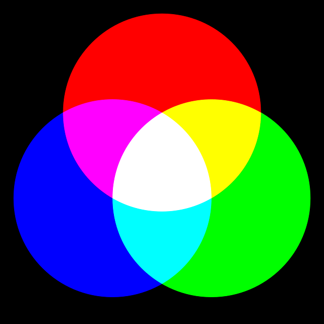
RGB, which stands for Red-Green-Blue, is what is known as an “additive color system.” Essentially, all of the pixels on a screen (there are millions) are all divided into three sub-pixels, which are then lit up to different brightnesses to make the colors red, blue, and green.
Depending on the brightness level of each sub-pixel, a different final color is created.
When all three sub-pixels are lit up, the resulting color is white. When you want black, you add no light.
This is why OLED TV screens produce such vivid colors. Individual pixels can be turned off to produce perfect blacks, which creates great contrast and a sharper overall image.
In total, an RGB color system can produce more than 16 million different colors. This, and the fact it needs light, is why RGB is used in televisions and other digital formats.
CMYK Explained

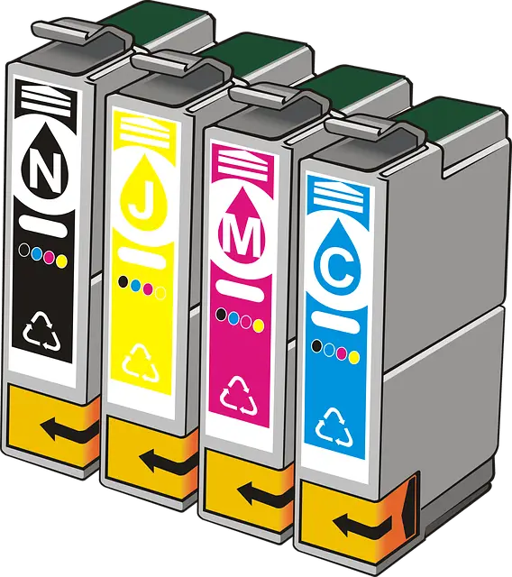
The other color system is CMYK, which stands for Cyan, Magenta, Yellow, and Key/Black.
In many ways, it is the complete opposite of RGB, mainly because it is an additive system. It uses paint and/or ink to create layers of colors that produce a final shade.
In CMYK, the default color is white, and each layer of ink makes the color darker until black is produced.
Because it relies on ink/paint, CMYK is what printers and painters use. It can more reliably produce true black, but it also combines to make fewer overall colors. In total, there are around 16,000 different combinations.
Is It Better to Design with RGB or CMYK?

To answer this question, you need to know what is going to happen with your final product. If it’s going to be displayed on a digital screen, such as a computer, phone, or television, it makes the most sense to design in RGB, as the colors you choose can be replicated perfectly on the screen.
However, if the final product is going to be printed, then there is an argument to be made that you should design in CMYK, which means changing the settings on your graphic design program.
But this isn’t always recommended. This is because your computer uses the RGB system to display colors, so if you change to CMYK, what appears on your screen will not look the same as the actual colors.
Instead, the best thing to do is to design in RGB and then, convert to CMYK. This will change your colors slightly, but then you can adjust manually to make sure the final product looks exactly the way you want.
Of course, some of this is a personal preference. But if all you’ve ever done is design in RGB, then it’s best to stick with what you know.
Design the Colors You Want
Now that you know the difference between RGB and CMYK, it should be a lot easier to decide which system to use when designing. With this knowledge, you will now be able to create stunning images that will appear in person just as they do on your computer and in your imagination.


